

A bad room colour design can usually be improved by choosing a balanced color palette, adjusting lighting, adding complementary accents, and using colors that match the room’s size and purpose. Even small changes, such as repainting one wall or replacing decor items, can make a room feel more inviting, stylish, and comfortable without a complete redesign.
Fast Info Table
| Aspect | Details |
| Topic | Bad Room Colour Design |
| Common Problems | Colors feel too dark, too bright, mismatched, or outdated |
| Quick Fix | Use neutral tones and balanced accent colors |
| Best Colors for Small Rooms | Soft white, beige, light gray, pale blue |
| Best Colors for Cozy Rooms | Sage green, warm taupe, muted terracotta |
| Avoid | Excessive neon shades and harsh color contrasts |
| Budget-Friendly Solution | Repaint walls, update curtains, cushions, and artwork |
| Main Goal | Create harmony, comfort, and visual balance |
Identify What Makes the Color Scheme Feel Wrong
Before making changes, determine why the room feels unattractive. Some spaces look uncomfortable because the wall color clashes with furniture, flooring, or lighting. In other cases, the room may simply feel too dark or overwhelming.
Common signs of a bad room colour design include:
- Walls that make the room feel smaller
- Colors that appear different throughout the day
- Strong contrasts that create visual stress
- Outdated color combinations
- Poor coordination between walls and décor
Understanding the specific problem helps you choose the most effective solution instead of making random design changes.
Choose a More Balanced Color Palette
One of the easiest ways to improve a room is by simplifying the color scheme. Interior designers often recommend the 60-30-10 rule:
- 60% dominant color (walls)
- 30% secondary color (furniture)
- 10% accent color (decor)
Neutral shades such as white, cream, greige, and light gray work well because they complement most furniture styles. If you prefer more color, muted blues, greens, and earthy tones usually create a calmer atmosphere than overly bright shades.
A balanced palette makes the room look intentional rather than chaotic.
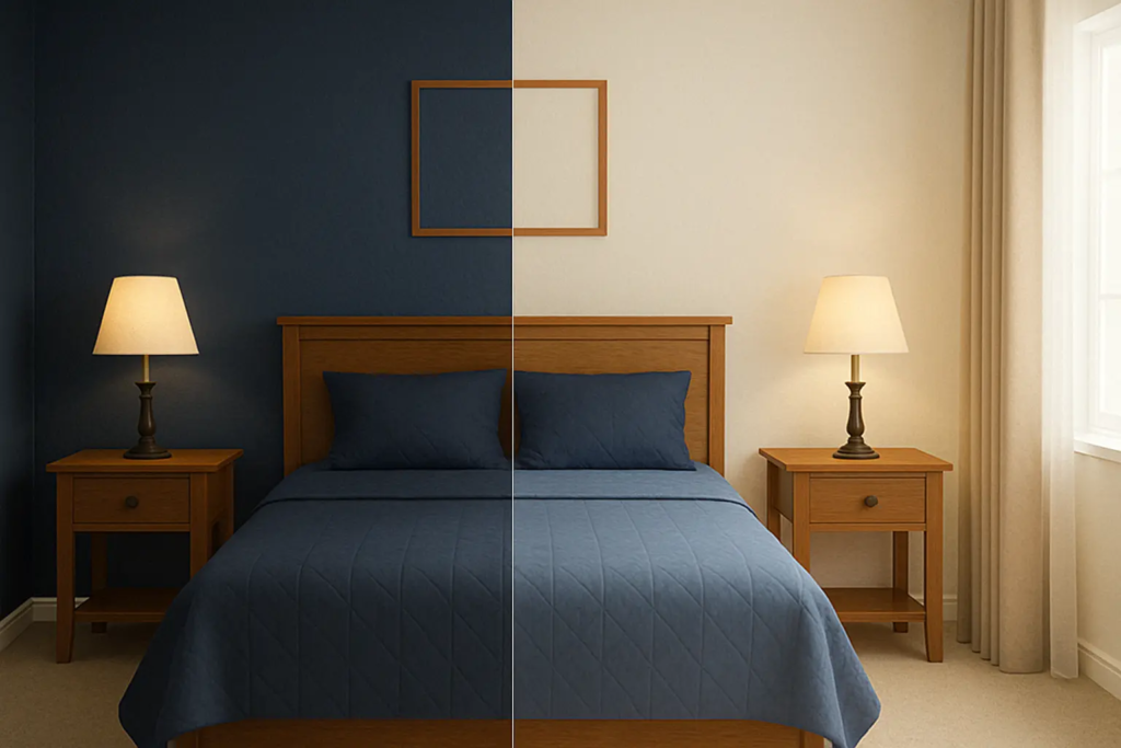
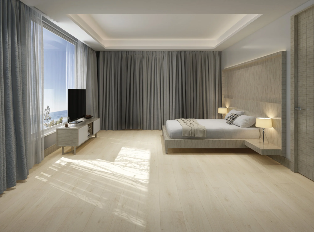
Improve Lighting to Enhance Color Appearance
Lighting has a major impact on how paint colors look. A wall color that seems perfect in a showroom may appear completely different at home.
Natural light generally makes colors look brighter and more accurate. Rooms with limited sunlight often benefit from lighter wall colors that reflect available light.
Helpful improvements include:
- Using warm white LED bulbs
- Adding table or floor lamps
- Hanging mirrors to reflect light
- Choosing lighter curtains
Many homeowners discover that improving lighting solves much of their bad room colour design problem without repainting every wall.
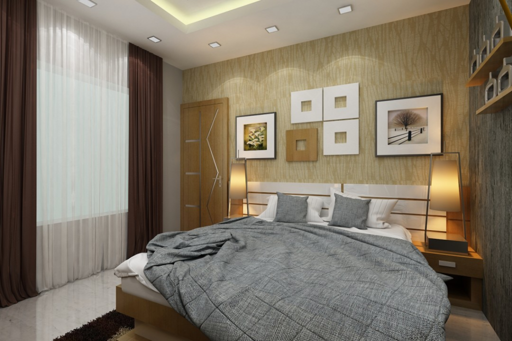
Use Decor and Accents to Create Harmony
A room’s overall appearance depends on more than paint alone. Decorative elements can soften harsh colors and create visual balance.
Consider adding:
- Neutral rugs
- Coordinated throw pillows
- Artwork with matching tones
- Wooden furniture accents
- Indoor plants
For example, if the wall color feels too cool, warm-colored accessories can make the space feel more welcoming. Likewise, if walls are overly bright, neutral decor can reduce visual intensity.
Small decorative changes often deliver impressive results at a lower cost than a complete makeover.
Match Colors to the Room’s Purpose
Every room serves a different function, and colors should support that purpose. Bedrooms typically benefit from calming shades, while living rooms can handle slightly richer tones.
Popular choices include:
- Bedrooms: soft blue, sage green, warm beige
- Living rooms: greige, cream, taupe
- Home offices: muted green, light gray
- Dining rooms: warm neutrals and earthy colors
Choosing colors that fit the room’s intended use creates a more comfortable and practical environment.
Conclusion
Improving a bad room colour design does not always require a major renovation. By identifying the problem, selecting a balanced color palette, improving lighting, adding complementary décor, and choosing colors that match the room’s purpose, you can transform an unattractive space into one that feels comfortable, modern, and visually appealing. Read About More Tiny Home Ideas
FAQs
How can I fix a bad room colour design without repainting?
You can improve the look with better lighting, coordinated décor, rugs, artwork, cushions, and curtains that balance the existing colors.
What colors make a room look larger?
Light shades such as white, cream, pale gray, and soft blue reflect more light and create a more spacious appearance.
Which colors should I avoid in small rooms?
Very dark colors and highly saturated neon shades can sometimes make small rooms feel more confined if not balanced properly.
How many colors should a room have?
Most designers recommend using three main colors following the 60-30-10 rule to maintain visual harmony.